Verizon
Interaction Design System
Client: Verizon
Role: Lead Designer
Contribution: Design System, Motion Graphic, Interaction Design
Developing the future-state vision for Amazon Wallet+, an AI-driven platform that elevates Amazon Pay from a payment utility to a holistic financial and shopping companion. The primary goal was to unify on and off Amazon shopping experience, along with financial management support to drive maximum customer value and strengthen Amazon's ecosystem.
Problem
There is an overwhelming amount of information on the website. On top of that, poor navigation and unclear hierarchy make users find it really hard to find specific information. As a result, users tend to leave the site in a short time and have a very low click-through rate
Goals
Increase user retention and user engagement
Increase brand awareness by adapting the existing brand system to animations

Old website design
How I solve the problem
Internally, it served as a shared reference to align design, product, and engineering on interaction principles, while externally it supported user testing by allowing us to validate how motion improved comprehension, engagement, and overall click-through behavior within the Brand 3.0 experience.
To address the site’s information overload and navigation challenges, I created a motion library for key interactions to bring clarity, consistency, and alignment across teams. The library defined how micro-animations and interaction patterns signal hierarchy, guide attention, and provide visual cues for navigation, helping users find information more intuitively.


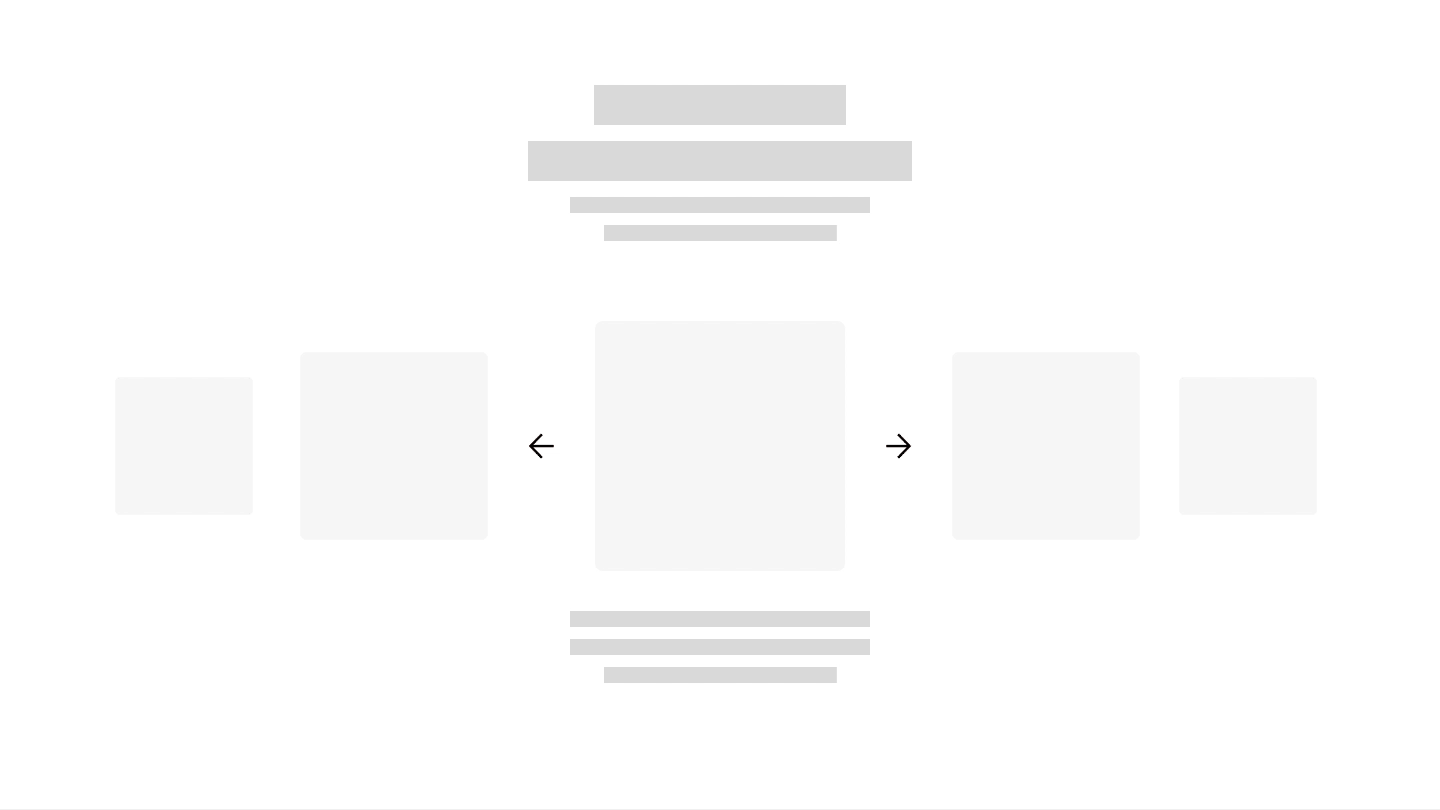


Example of vertical carousel

Example of horizontal carousel

Example of text parallax effect
By introducing motion such as parallax effects and visual storytelling, the experience guides users through content with clarity and intention. Micro-animations highlight key moments, progressively reveal information, and create a natural flow that reinforces hierarchy and the brand narrative—making the experience more engaging and memorable.
Example of objects revealing on scroll
Example of interactive objects
Storytelling
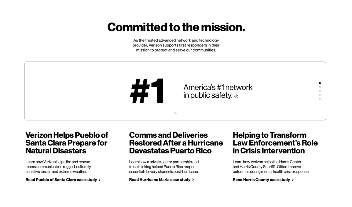
Infographic that explains complex technology

Impact
As a result, the motion library improved consistency and clarity across the experience, strengthening internal alignment and accelerating iteration during user testing. Usability tests showed clearer navigation paths, with task completion improving by ~25% and time spent on key pages increasing by ~20%. The added interaction cues also contributed to higher engagement, helping reduce early drop-off and reinforcing a more cohesive and distinctive Brand 3.0 experience.
